All You Need To Know About 2025 Dulux Colour Trends
Colour trends significantly influence creative decisions in the ever-changing field of design. As we approach 2025, the Dulux Colour Forecast has unveiled a captivating palette expected to dramatically impact interior designers, artists, and surface pattern designers. Staying up-to-date with these trends isn’t merely about sticking to fashion but about leveraging the potential of colour to boost creativity and market demands.
The 2025 Dulux Colour Forecast (https://www.dulux.com.au/) is a hugely awaited yearly event that sets the pace for paint colour trends for the upcoming year. A design professional needs to remain informed about these colour trends if they want to produce work that resonates with clients and the broader design community. It offers invaluable insight as to how to remain ahead of the interior design curve for 2025. Dulux's Colour Forecast has become a critical element in the design calendar, as it establishes the tone for Australian interior design and the colours that we can anticipate in the coming year and beyond. So, what can we expect?

Overview of the 2025 Dulux Colour Trends
The 2025 Dulux Colour Forecast showcases various palettes, each reflecting a distinct mood and source of inspiration. These trends are influenced by societal, environmental, and cultural factors, providing a glimpse of the current climate. The introduction of three new palettes, Still, Recollect, and Emerge, demonstrates the significant role that play in eliciting a sense of positivity and nurture.
Let’s delve into the featured 2025 Dulux colour palettes:
STILL
The Dulux Still palette inspires one to remain just like it sounds – still. The colours here are a reaction to the fast-paced, hectic lifestyles that many individuals lead. Although it continues to make a statement, this palette is less breathtaking and more reminiscent of deep inhaling and tranquillity. It still embodies the concept of leisure and motivates a person to appreciate the beauty and ease of daily life.
The palette incorporates both warm and cold earthy hues that serve to establish a sense of stability and establish a connection with nature. Considering how the biophilic design has gained traction over recent years, the Dulux Still palette is an ideal fit for this design idea as it provides a nurturing environment.

(Photo by Dulux)
The Palette
The Still palette is a warm, secure environment that harmoniously blends with soft, dark hues and comforting, serene, cooler tones. It features warm neutrals with brown undertones.
RECOLLECT
The best way to describe the Dulux Recollect palette is that it is a lush combination of organic colours and sombre, sophisticated tones, resulting in a bold and authentic palette. This year, purple, opulent burgundies and wine colours are expected to be prominent. Recollect provides a sense of opulence that is both familiar and unpretentious. The palette is infused with confidence, creating a stunning blend of emotions and comfort while simultaneously evoking feelings of reminiscence.
Recollect's major source of artistic colour inspiration was second-hand influences that combined classic design elements with contemporary pieces. It enables the elder generation to derive solace from the past, while the younger generation will be exposed to the novel and thrilling opportunities accompanying this concept.

The Palette
One won't need to travel back in time to unearth deep olive hues, soft oranges, yellow-based greens and vibrant coral colours. Recollect also includes tonal browns, dark purple hues, and a subtle red accent, in addition to these bold and vivid colours.
EMERGE
The Dulux Emerge palette embodies the concept of coming out into the fold – just like it sounds, it's all about getting known. This palette is characterised by mid-toned hues and gentle, uplifting colours, which promote self-expression. The youthful colours of Emerge celebrate connection, fostering a feel-good energy that brings pleasure to any space without the risk of overwhelming it. This cheerful palette is the solution to establishing an empathetic, gentle, and welcoming home.

The Palette
This soulful palette is brimming with imaginative pastel shades, featuring muted purple blues, which colour direction as we approach 2025, breathtaking drop shades, and orange-based pinks. This colour is sure to bring out the inner embodiment of any client.
The Dulux Colour Forecast 2025 has left us with a sense of inspiration and empowerment. With the light-hearted self-expression of Emerge, the rich nostalgia of Recollect, and the slow-paced beauty of Still, we can't wait to see how each palette is integrated into interior design trends 2025
Impact on Surface Pattern Design:
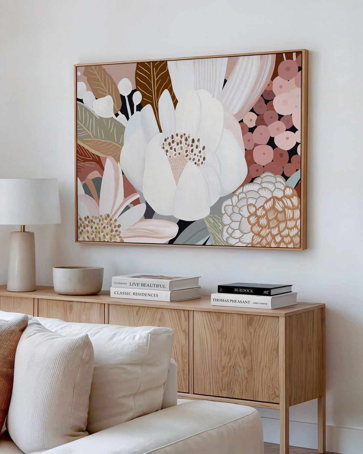
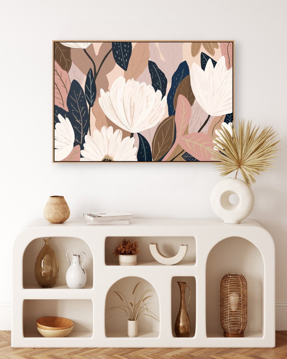
Surface pattern designers can leverage the 2025 Dulux Colour Trends to create fresh, innovative designs that resonate with contemporary tastes. By incorporating these colours into their patterns, designers can tap into the latest trends while maintaining their unique aesthetic.
- Experiment with Colour Combinations: Explore unexpected pairings of colours from different palettes. For example, combine vibrant blues and greens with warm tones and terracotta for a striking contrast.
- Consider Texture and Pattern: Pair the 2025 colour trends with complementary textures and patterns. For instance, use a geometric pattern with a soft, neutral background to create a visually interesting design.
- Pay Attention to Scale: Your pattern's scale can significantly impact your design's overall feel. Experiment with different scales to find the one best suits your chosen colour palette.
Impact on Artists
Artists can also benefit from the 2025 Dulux Colour Trends by incorporating these hues into their work. These colours can add depth and dimension to artistic creations.
- Explore Different Media: Experiment with various media, such as painting, sculpture, or mixed media, to see how these colours can be expressed differently.
- The Mood and Message: Think about the mood or message you want to convey through your artwork and choose colours accordingly. For example, if you're going to create a sense of calm, opt for earth tones and neutrals.
- Collaborate with Other Artists: Collaborate with other artists to create joint projects incorporating the 2025 Dulux Colour Trends. This can lead to unexpected and inspiring results.
Impact on Interior Designers:
Interior designers can use the 2025 Dulux Colour Trends to create stylish and functional spaces. Designers can create a harmonious and inviting atmosphere by carefully selecting colours and materials.
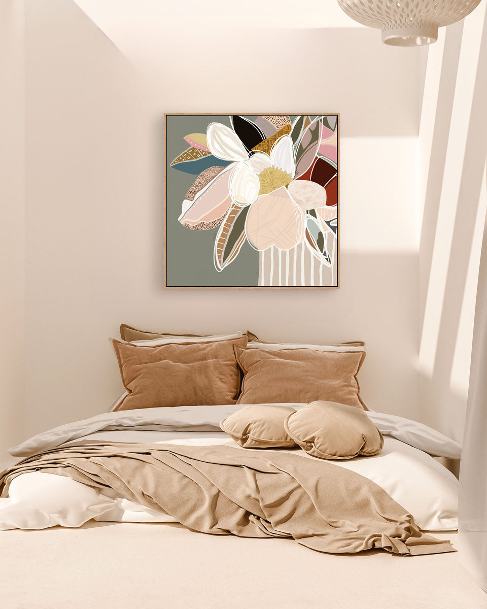
- Consider the Overall Mood: Consider the desired mood for the space and choose colours accordingly. For example, if you want to create a relaxing bedroom, opt for soft neutrals and pastels.
- Pair Colours with Furniture and Textures: Consider how the 2025 colour trends will interact with existing furniture and textures in the space. Experiment with different combinations to find the perfect balance.
- Pay Attention to Lighting: Lighting can significantly affect how colours appear in a room. Consider the natural and artificial lighting in the space when selecting your colour palette.
Practical Tips for Incorporating the 2025 Dulux Colour Trends:
Surface Pattern Designers
- Experiment with Unexpected Pairings: Combine colours from different palettes for a striking contrast. For example, pair vibrant blues and greens with warm tones and terracotta.
- Consider Texture and Pattern: Pair the 2025 colour trends with complementary textures and patterns. For instance, use a geometric pattern with a soft neutral background.
- Play with Scale: Experiment with different scales to find the one that best suits your chosen colour palette. A large-scale pattern can create a bold statement, while a small-scale pattern can add subtle interest.
Artists
- Create Limited Edition Prints: Incorporate the 2025 colour trends into limited edition prints or series. This can add value and exclusivity to your work.
- Experiment with Mixed Media: Combine different art forms, such as painting and collage, to create unique pieces that incorporate the trending colours.
- Consider the Mood and Message: Think about the mood or message you want to convey through your artwork and choose colours accordingly.
Interior Designers
- Use Colour Accents: Introduce the 2025 colour trends as accents, such as throw pillows, artwork, or rugs, to incorporate them into existing colour schemes gradually.
- Create Focal Points: Use the trending colours to create focal points in a room. For example, paint a feature wall or accentuate a piece of furniture with a bold colour.
-
Consider Natural Light: How light affects colours can impact the overall feel of a room. Choose colours that complement the existing lighting conditions.
Recommended Tools and Resources - Colour Matching Apps: Use apps like ColorSnap Visualiser by Sherwin-Williams or Dulux Visualiser to see how different colours will look in your space.
- Dulux Professional Resources: Explore Dulux's professional resources, including colour trend guides and design inspiration.
- Design Blogs and Magazines: Follow design blogs and magazines for the latest trends and inspiration.
- Online Colour Palettes: Use online tools like Adobe Color or Canva to create and experiment with different colour palettes.
Importance of the 2025 Dulux Colour Trends for design professionals!
There is a desire to calm down and appreciate life's everyday moments to take a moment and take in all the special moments life offers. There’s so much that a colour palette has to offer. As Surface pattern designers, artists, and interior designers, you should take this opportunity to incorporate the latest 2025 Dulux Colour Trends into your work if you want a cutting edge against your competitors!
You can do exactly that by following this guide on 2025 Dulux Colour Trends!
Designers often balance trend adoption with maintaining their unique style
Balancing Trends and Authenticity in Surface Pattern Design

One of the key considerations for surface pattern designers is staying up-to-date with trends while maintaining a unique and recognisable style. The 2025 Dulux Colour Trends, with their blend of warm neutrals, pastels, and richer hues like greens and burgundies, offer a diverse palette to experiment with. Here are a few strategies to help you navigate this balance:
Utilise Trending Colours as Accents
Instead of overhauling your entire design, consider incorporating trending colours as accents. This allows you to nod to contemporary trends while preserving the essence of your signature style. For example, integrate pops of rich burgundy into your existing patterns to add depth and contemporary flair without overwhelming your original designs.
Blend Trends with Timeless Elements
Mix the trending hues with timeless elements such as heritage patterns or vintage-inspired motifs. The fusion of newer colour palettes with classic designs can create a harmonious balance and offer a fresh yet familiar appeal that resonates with a broad audience. Imagine a quirky floral pattern infused with calming pastels or a geometric design featuring warm brown undertones.
Experiment with Contrast and Combination
Take advantage of the broad spectrum of colours forecasted by Dulux to play with contrast and combinations within your patterns. Pair muted colours with bold hues to create dynamic compositions. For instance, contrasting velvet furnishings with clashing patterns can give a nod to modern glamour whilst maintaining a coherent design identity.
Stay True to Your Voice
While following trends can help your designs stay relevant, it’s crucial to remain authentic. Consistently reflect on how new colours and patterns align with your brand's story and ethos. The key is to adapt trends to enhance your unique style, rather than letting trends define it. Customising decorative objects with layers of textured materials in trending colours can be a subtle yet effective way of staying current.
Engage with Your Audience
Your audience's feedback can provide invaluable insight into how trends are resonating with them. Engage with your followers through social media or surveys to gauge their reaction to new colour incorporations, helping you fine-tune your designs and better meet market demand.


Leave a comment